How My Eye Sees the New Facebook Timeline Interface
This past week, Facebook announced a total overhaul of user profiles and also released a beta version to Developers. I took a peek at my account with the new style and felt pretty bombarded by four columns, tickers, chat lists at least three containers for navigation but it’s okay, I can handle it – my real concern is with eye tracking and the timeline.
Facebook turned their timeline into an actual “Timeline” – cute idea that just seems like a natural thing to do. I wish I could say the same for the interface execution but unfortunately, it just seems forced.
Let’s assume I read most things from left to right and see what would happen if I scanned a Facebook profile:
![]()
Not Bad! We got a nice straight forward zig zag reading pattern – kind of reads like a book doesn’t it? Left to right and you can sort of predict where the next line will start.
Now, let’s see how this compares to the new Facebook profile…
![]()
Hmm… Not sure where I should even begin. Like I said, I’d normally start at the top left and work my way down row by row, but the starting point of the next line is sometimes in the center. Seems unnatural. If I were trying to find a status update someone posted I’d surely, I’d lose my place pretty easily.
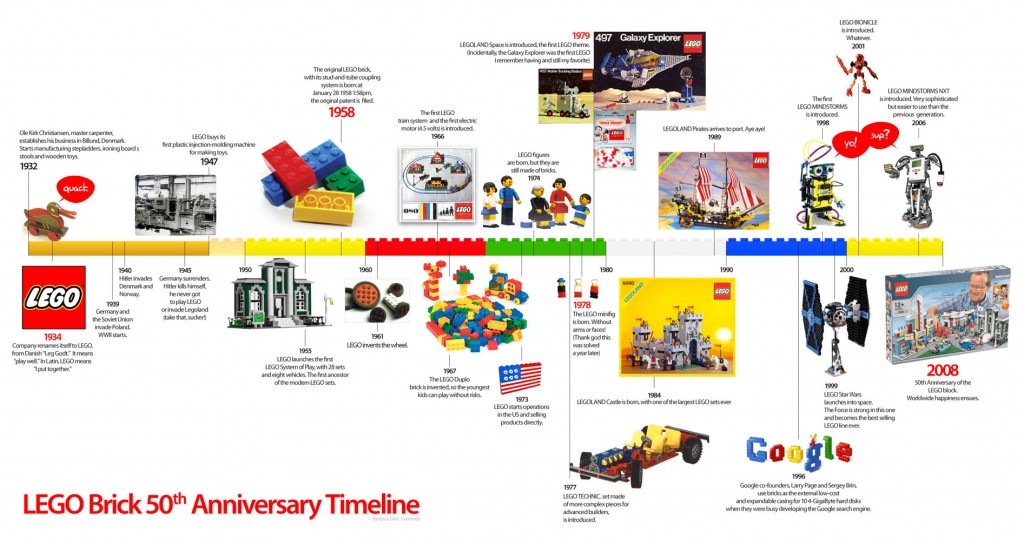
Timelines mapped out like the new Facebook profile are meant to study short pieces of data, like this lego timeline. How many times will you look at this? Probably once or twice. How many times will you look at Facebook profiles each day? This format isn’t meant for everyday use.
The giant picture at the top of the new design was the most impressive part, but big deal if I can’t read the content below it.
