This site runs on its own small design system.
Tokens, a type ramp, and a handful of patterns, documented here as living examples rendered by the same stylesheet that renders every page.
Brand


Wordmark
Christina Dobi
wordmark · bold 26px in $color-brand-ink · anchors the header on every pageThe biggest brand moment is the homepage hero: full-screen video under an 85% $color-brand-ink overlay, with the white monogram and wordmark reversed out. Everything in the hero is large type, which keeps it readable over any video frame.
Color
Each project on the work page carries one color, shown in its tile overlay. Every one holds white tile text at 4.5:1 or better.
Type
Heading one
h1 · Source Sans Pro · normal · 2.441em / 3.052emHeading two carries the statements
h2 · bold · 1.953em / 2.441em · used with .subhead for page openersHeading three for article sections
h3 · normal · 1.563em / 1.953emHeading four titles cards and list items
h4 · normal · 1.25em / 1.333emSection headline
h4.headline · uppercase with eyebrow tracking · labels a homepage or style-guide sectionThe subhead is the standfirst under a statement.
.subhead · weight 100 · 24pxEyebrow label
eyebrow pattern · 13px bold caps · 0.12em tracking · accent -ink colorBody copy is Source Sans Pro light at 18px ($type-body-size) with 1.6 line height, in $color-body gray. Links pick up the brand ink blue, and emphasis uses the navy text color.
p · weight 200 · 18px / 1.6 · $type-body-sizeSpacing
Landing sections breathe at $space-lg, opening to $space-xl on wider screens (section-rhythm mixin).
Layout
Pages sit on a 12-column grid. Long-form content lives in a centered 9-column reading measure; back links and headers align to the container edge. Sections alternate between three full-bleed bands:
Patterns
Accent card
.accent-card component (card.scss) · white surface, 4px $color-brand top border, $shadow-card · one accent color onlyEngineering
Building robust, maintainable products from the ground up.
Product Innovation
Turning ideas and opportunities into products.
Featured work section
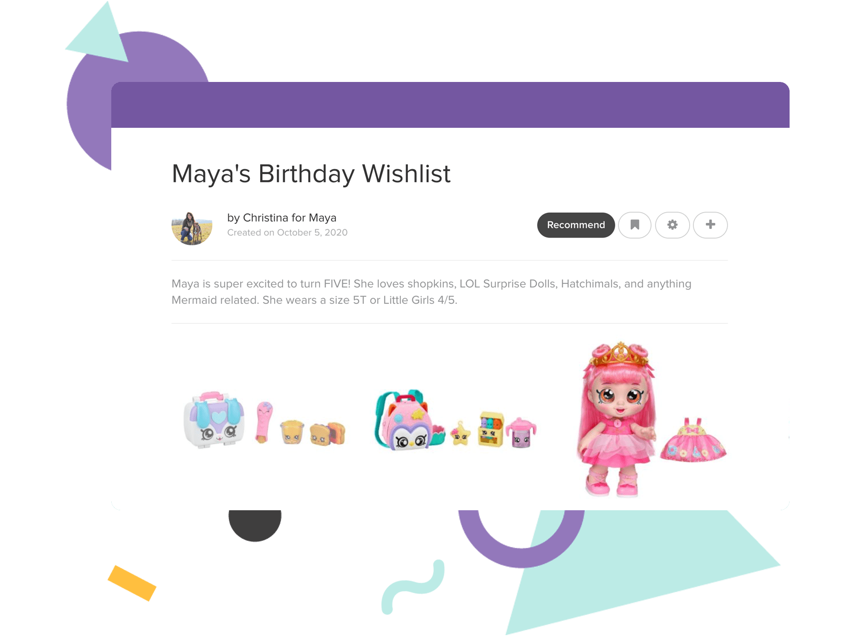
title + chip, intro, sub-items over rounded media panels tinted with the project accent (10% mix)Zebbly Live Product
Wishlists with context
Lists carry sizes, interests, and notes.
Back link
eyebrow style in $color-brand-ink · nudges left on hover · tops every detail page, aligned to the container edgeCall to action
.ed-cta · bright $color-brand pill, bold navy label · inverts to navy on hoverHighlight band
.container-highlight · full-bleed $color-brand-ink band with white text (4.8:1)Say Hello
Full-width brand moments: the contact band, the Instagram section.
Links
A default link is $color-brand-ink blue, deepening on hover.
a · $color-brand-ink · hover $color-brand-deep · underlined when inside running text .ed-more-link · bold, with a trailing arrow · section footersMotion
Content enters with a fade.
.fadeInUp / .fadeIn · 1s ease, 0.2s delay · statements and page openers onlyEverything interactive answers in 0.15s ease: cards lift their shadow, tiles reveal their accent bar, the back link nudges left, the CTA deepens. Motion confirms, it never decorates.
Motion is optional: when the visitor prefers reduced motion, entrance fades are skipped and the hero video starts paused. The video always carries its own pause control.
Imagery
Portfolio tiles are 4:3 (1600×1200) screenshots or product art. Work pages show full-width screenshots on $color-band-light bands, up to 1000px wide. Featured panels crop tall screenshots at a 16px-radius edge, top-aligned, over a 10% accent tint. Photos get an 8px radius.
Accessibility
The system is built to WCAG 2.1 Level AA. The rules below are part of the design language, not an overlay on top of it.
Contrast
Every text color meets a 4.5:1 contrast ratio on the surfaces it appears on, including $color-band-light and the accent tints. $color-body (5.3:1) and $color-muted (4.5:1) are the lightest grays allowed for copy. $color-brand-ink is the single text blue, holding 4.8:1 on white; the bright $color-brand survives as fills that carry navy text, never white. Accent colors used as text swap to their -ink variants.
tokens.scss documents the measured ratio next to each colorKeyboard
A skip link jumps to the main landmark, every page uses one
<main>, and all interactive elements show a 3px
$color-brand-ink focus ring. Hover-revealed content, like the portfolio tile
overlay, also reveals on focus.
Motion
The hero video has a visible pause control and respects
prefers-reduced-motion, which also disables entrance animations.
Images and icons
Every content image carries descriptive alt text; images that repeat adjacent
text use empty alt. Icon-only links carry aria-labels and hide
their glyphs from screen readers.
Links
Links inside running text are underlined, never distinguished by color alone.
Voice
Sentence case everywhere, including headlines; only section labels are uppercase. Statements are short, first-person claims: "I build thoughtful products that make complex things feel simple." Never an em dash; reach for a comma, a colon, or a middot. Middots separate inline lists: Product · Frontend · UX. Plain words over jargon.
The system lives in _sass/tokens.scss, _sass/patterns.scss, and shared components like _sass/card.scss.